Love Wheel Records
Logo, Website, Merch
THE CHALLENGE
The challenge of this project was to create a logo-driven brand for a locally-owned vinyl shop called Love Wheel Records. I was to create their logo and brand identity along with a website and branded merchandise.
CONCEPT
To create a compelling design that embodies the nostalgia, warmth, and timeless appeal of vinyl records, while also conveying the modernity and uniqueness of the business.
Research & Discovery
The business is fairly new they had first opened shop during the pandemic in 2020, so they began on a rough start. They were so fresh on the market that they didn’t necessarily have a brand quite yet either. The branding they were currently using was something that the owners had made themselves in Microsoft which was just a general serif typeface of the business’ name in retro colors.
When beginning this project I wanted to try and capture the vibe of the business. During my visit to the store, the environment was very welcoming and laid back. My first impression of the interior was very retro and had a sense of nostalgia in the air. It was a place that was welcoming to music lovers of all different kinds. Even though the business itself was still small, it has the potential to grow, so I wanted to create a logo that could be flexible with that growth.
I drew inspiration from designs from the 70s while keeping in mind the design they had already established for themselves. Being a vinyl enthusiast myself, I went through my collection and pulled some ideas from the covers. Mostly focusing on the typefaces and the hierarchy of the text. I also looked at the design elements incorporated on them such as the movement and shapes of the line. I wanted to use vibrant bold colors, such as oranges, yellows, and red to draw in the eyes that were typically common during the time of the rise of vinyl.
Ideation
As I began my sketches I played around with using various typefaces and illustrations to use with the logo. I should probably mention the store kind of had an un-named mascot, which was the owner’s dog Jo, who is always there to greet the customers! I thought it would be fun to incorporate a few ideas of him in the logo since he’s been such an essential part of the business. As for the rest of the sketches I tried to play around with different views of an actual vinyl record being incorporated and tried out various retro typefaces to reflect the concept of the business.
Digital Drafts
After narrowing down my sketches, I finally landed on 4 different directions I wanted to go with. They all had different concepts that I liked and wanted to further explore. Using the final 4, I created different variations of them playing around with the placement of the text and trying out different design elements to each of them.
OPTION 1
Option 1 embodies the concept of losing oneself in music and becoming fully immersed in its enchanting melodies. Music resonates uniquely with each individual, much like our distinct fingerprints. Just as each groove on a record produces a distinct sound, every listener experiences music in a deeply personal way.
OPTION 2
The owners' dog is often present to warmly welcome customers, so I wanted to incorporate this charming aspect into their logo. Option 2 features a retro typeface complemented by an adorable illustration of a dog holding a vinyl record, reminiscent of a pup grasping a frisbee.
OPTION 3
In option 3, I opted for a more streamlined design approach by combining a retro typeface with a straightforward record motif replacing the letter "O". I experimented with positioning a heart symbol to mimic the needle used to play records, adding a subtle yet playful touch to the overall aesthetic.
OPTION 4
In the final option, I pursued a more minimalist approach, featuring a simplified illustration of a dog with the nose cleverly integrated as the central space of a record. I then experimented with various font weights and placements to achieve the desired visual balance.
Final Design
Typography & Color
Nocturne Blue
HEX #0F486E
CMYK 2, 18, 74, 0
RGB 15, 72, 110
Crimson Red
HEX #E43A25
CMYK 11, 86, 90, 2
RGB 228, 58, 37
Tangerine Orange
HEX #F6851F
CMYK 7, 54, 86, 0
RGB 246, 133, 31
Dandelion Yellow
HEX #FFCB42
CMYK 2, 18, 74, 0
RGB 225, 203, 66
Patterns & Assets
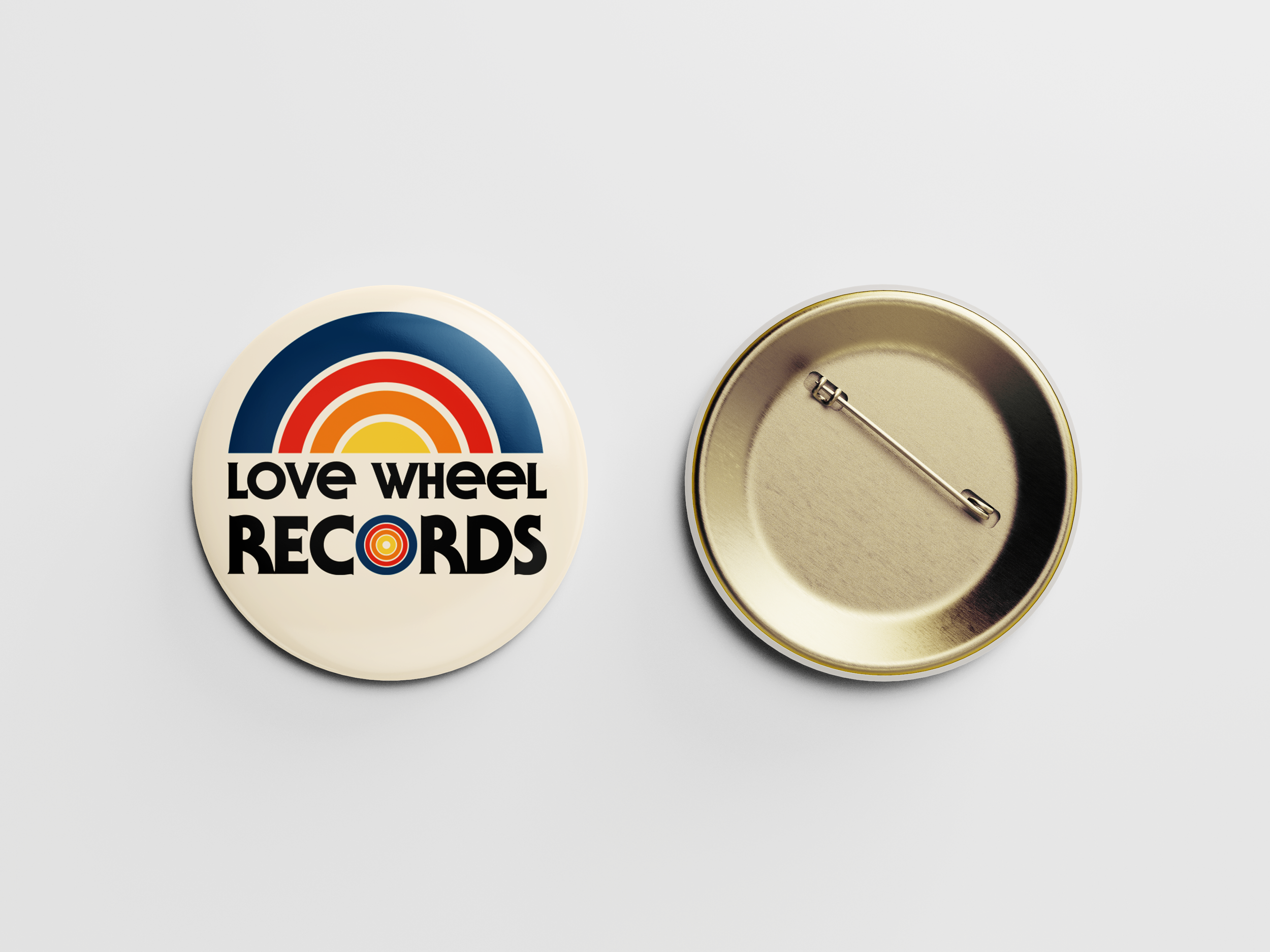
At the project's outset, the absence of an existing logo or branding afforded me the freedom to start from scratch. A primary challenge was grappling with the length of the name itself, as it contained numerous characters. Striking a balance between brevity and clarity posed a creative hurdle, but ultimately, I achieved a harmonious fusion of the words. Throughout the process, I relished the opportunity to experiment with new typefaces, which invigorated my creative journey.
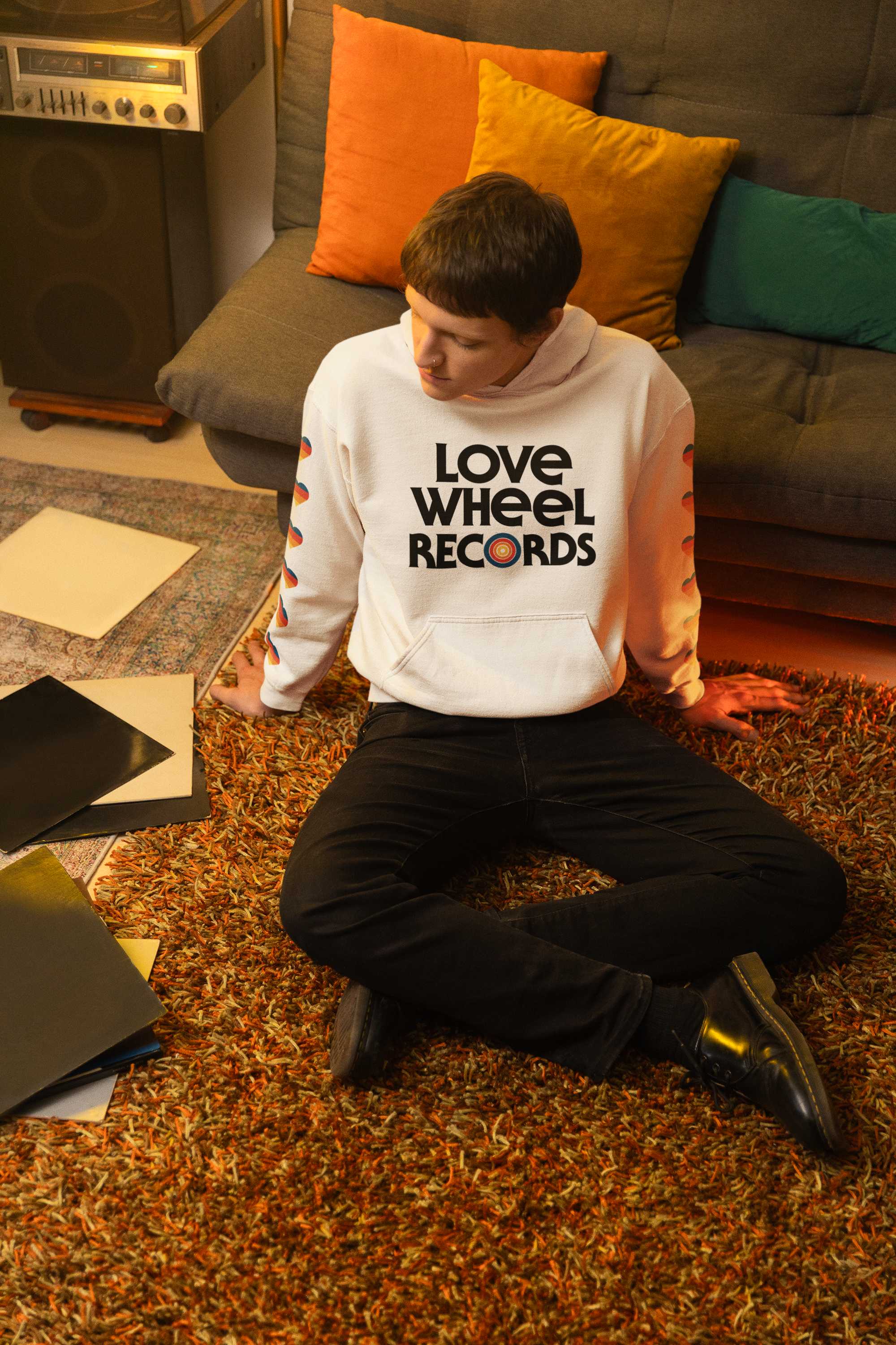
Overall, I'm pleased with the outcome. The design effectively encapsulates the essence of the business while allowing for adaptability across various applications.


