ROC Skin Serum
Brand Identity, Packaging, Social Media
THE CHALLENGE
It was truly gratifying to rebrand a trusted product that I use, the ROC Multi-Correxion serum. My task involved reinventing the brand and designing packaging tailored for a boxed product. The design needed to be versatile enough to cater to a range of products within the series.
CONCEPT
The design concept for ROC Skin Serum embodies a harmonious fusion of elegance and functionality. The packaging reflects a sophisticated aesthetic, with clean lines and a minimalist approach, signaling the product's premium quality and efficacy. The color palette evokes a sense of purity and clinical precision, complemented by subtle accents that convey modernity and sophistication.
Research & Discovery
During my research, I observed that the original product tended to blend in with other skincare items rather than making a distinct impression. Additionally, I noted that the packaging was overloaded with text, resulting in redundancy and clutter. It was challenging to differentiate between products based on their usage, as the only distinguishing feature was a colored line wrapping around the package.
While compiling my research I tried to keep in mind what questions frequently asked question the consumer would ask when looking at the packaging. What are the key ingredients? What are the benefits of using this product? How much should I use? How big is it or how many capsules come inside? These were all important things to keep in mind before creating my design.
I wanted to create something a bit more elegant and modern that pops out from the shelves. When someone picks up the packaging they can find the most important information quickly without having to search the whole box.
Ideation
I began by sketching several ideas and then narrowed them down to three of my most promising options. Subsequently, I translated these concepts into digital drafts.
OPTION 1
For option 1, I opted for an elegant typeface paired with a straightforward color block design. I incorporated a cut-out window to showcase the product underneath.
OPTION 2
In the second option, I utilized a more illustrative display typeface, complemented by a dew-drop cut-out window to highlight the product's benefits.
OPTION 3
For option 3, I pursued a minimalist approach, focusing primarily on typography to create a clean and impactful design.
Final Design
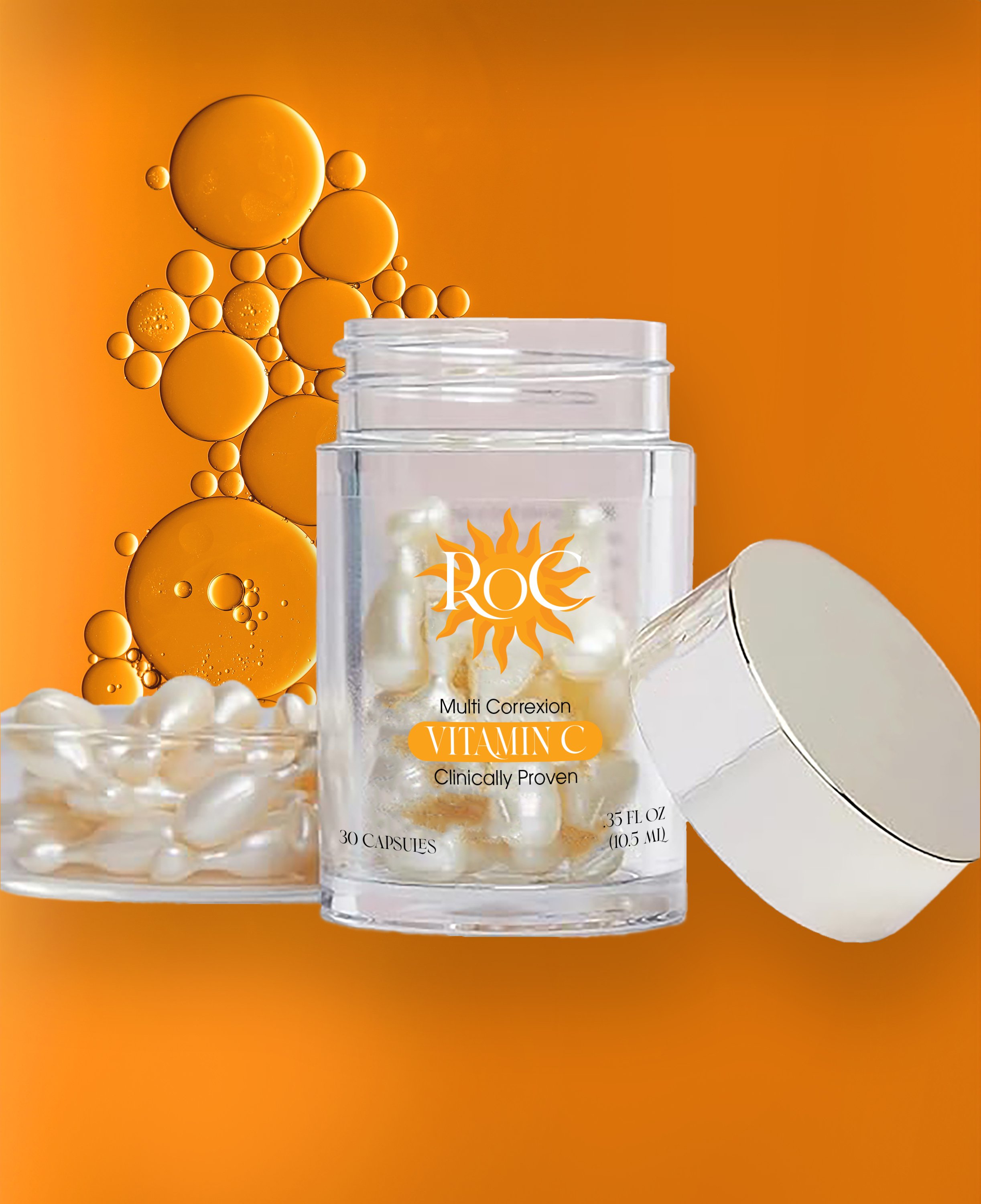
Given that this product comprises a series, I implemented different color schemes to facilitate easy differentiation between each item. Additionally, I crafted various icons to signify usage instructions or specific benefits. For instance, the sun icon indicates daytime use and skin-brightening properties. To enhance the visual appeal and readability, I incorporated gradients for a luxurious and elevated aesthetic.
Typography & Color
Assets
The most challenging aspect, I found, was accommodating all the information from the previous package. The crowded layout necessitated extensive experimentation with typefaces. Utilizing a type family with a range of options proved invaluable in overcoming this hurdle.
Overall, I'm pleased with how the product turned out. It was enjoyable to rebrand a product that I personally use, and throughout the design process, I kept in mind all the questions and considerations that I would have as a consumer. Being part of the primary audience helped make the design process a lot easier.
Reflection


